FCC's 8th Interactive Broadband Deployment Map - 2012
|
|
Section 706 Fixed Broadband Deployment Map The interactive map to the lower right was created by the FCC in 2012 to illustrate the Commission's broadband deployment results. It was found in the Eighth Broadband Progress Report which uses data underlying the National Broadband Map, as of June 30, 2011. It shows census block areas of the United States with and without access to fixed broadband of 3 Mbps download and 768 kbps upload. The term "rural" used in the key has the same meaning as defined by the 2010 Census. View additional demographic data and broadband deployment by technology by zooming in on and mousing over the specific county. The FCC is now up to the Fourteenth Broadband Progress Report, published for the second half of 2020, where it states, "As of the end of 2019, the vast majority of Americans, 94% had access to both 25/3 Mbps fixed broadband service and mobile broadband service with a median speed of 10/3 Mbps. Also as of the end of 2019, mobile providers now provide access to 5G capability to approximately 60% of Americans." FCC's Interactive Broadband Deployment Map - 2012 Broadband Progress Report Map – Another Digital First See the most recent FCC National Broadband Map by: Michael Byrne, Geographic Information Officer August 22nd, 2012 In another digital first for the FCC, we just released an interactive, web-based map that illustrates our Broadband Progress Report. This congressionally mandated report assesses how well broadband deployment and adoption is progressing in the nation. With this new map, our report is more responsive to both Congress and the American people.
Second, the map allows anyone access to the full set of raw data underlying the report. It used to be that maps like this were only viewed through complicated software or with specialized training. You do not need access to special software, or fancy understanding of intricate bureaucratic processes; all you need is a web browser. Third, by publishing this map, we make our own processes more open, accountable and effective. It makes the data available to all Americans, not just specialized practitioners A few more details. These maps are;
This story was retrieved from the FCC website. Neither the FCC nor any other entity represented in the article endorses this website.
Posted January 20, 2023 |
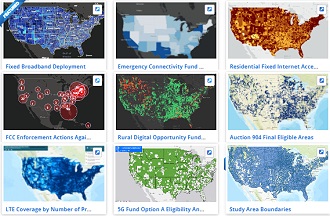
 This map is great for a bunch of reason. First,
as you zoom into the map or pan around, you can explore the intricate details of
broadband availability in each and every county in the United States. These details
include not just the population, and income numbers from the census, but the percentage
of each county that has access to the major fixed technologies providing broadband
service. This charting feature is a dynamic and robust way to investigate the data,
see how different communities compare to each other, or just look at your home town.
This map is great for a bunch of reason. First,
as you zoom into the map or pan around, you can explore the intricate details of
broadband availability in each and every county in the United States. These details
include not just the population, and income numbers from the census, but the percentage
of each county that has access to the major fixed technologies providing broadband
service. This charting feature is a dynamic and robust way to investigate the data,
see how different communities compare to each other, or just look at your home town.