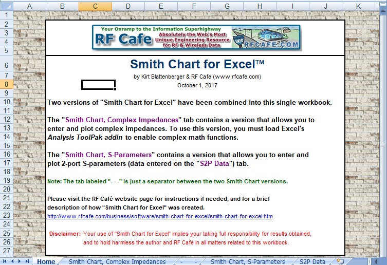
Smith Chart for Excel - Home Screen
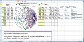
Smith Chart for Excel - Complex Impedance Input
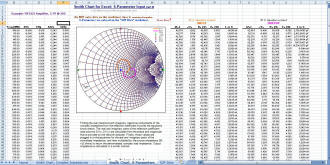
Smith Chart for Excel - S-Parameter Input
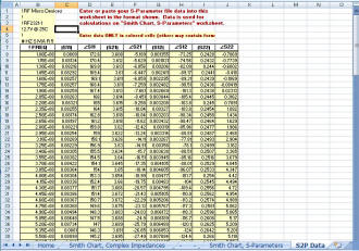
Smith Chart for Excel - S-Parameter Data
This combo version of Smith Chart for Excel™ includes both versions in
a single workbook. The original version, which I created in 2004, allows you to
enter a set of s-parameters at each frequency, and then a second version allows
you to enter a set of real and imaginary impedances at each frequency for plotting
on the Smith Chart. You need to enable the Analysis ToolPak (included with Excel
as an Add-In) to perform the complex math.
While there is nothing new about Smith Chart plotting software, what makes Smith
chart for Excel unique is that rather than tying up processor resources plotting
the resistance circles and impedance arcs, I set a Smith Chart graphic as the background
image for the chart, and then use the spreadsheet to calculate where complex impedance
points fall on the charts. Clever, non?
Compliments of Dan S.
<click for larger pic>
I have not been able to verify that the porting operation to
the Apple's Numbers™
spreadsheet is completely successful since I do not have access to a Mac. Dan is
a lot smarter than I am, so there is probably no issue. However, if you do find
something suspect, please let me know and I will pass it on to him.
Download
Smith Chart for Numbers™
Example:
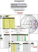
This example Excel workbook demonstrates how easy it is to implement a Smith
Chart using only a standard x-y scatter chart and coordinate conversions. The workbook
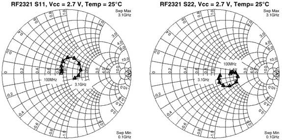
shown below used data imported from a typical S-parameter file (in this case an
RF2321 amplifier, from RF Micro Devices) and plotted on a chart that uses an image
file that contains a Smith Chart. Version 2.0 adds equivalent denormalized impedance
with equivalent resistance and capacitance/inductance values. Version 2.1 corrects
a graphical equation, but does not affect the accuracy of the previous versions (thanks to Peter for alerting me).
Step-by-step instructions are presented below. Click
here to download the example workbook. Click
here to download just the background Smith Chart graphic. Finally,
click here
if you would like a fully-detailed Smith Chart, created in Visio, with impedance
and admittance lines.
(Note: IE8 sometimes has problems with the ZIP. Please
use Chrome or Firefox, or, send me an e-mail)
If you appreciate the effort it took to develop this workbook, please consider
making a donation to RF Cafe by clicking here (at the bottom of the list).
Engineers use spreadsheets for a myriad of applications from calculating cascaded
chains of components to PLL phase noise prediction, but I can never recall seeing
S‑parameters plotted in a spreadsheet using a Smith Chart1. If a Smith
Chart is included in a spreadsheet, it is usually an image pasted in from some other
application. This article describes an extremely simple method of implementing a
Smith Chart using the built‑in graphing capability of any modern spreadsheet program
(Excel is used in this example). All that is required is an accurate graphic of
a Smith Chart for use as the chart background image, and a rectangular‑to‑cylindrical
coordinate conversion.

RF2321 Datasheet Excerpt
Although the example given here is used to plot S‑parameters from a file, the
possibilities are great for generating any sort of Smith Chart application such
as for impedance matching.
A general-purpose amplifier (RF2321) manufactured by RF Micro Devices is used
in this example, and its S-parameter file was downloaded from the RFMD website.
A copy of the datasheet Smith Charts are given for results comparison. Here are
step-by-step instructions for generating your first Smith Chart. Experienced Excel
users might want to skip down to the image loading and calibration section.
Smith Chart for Excel Instructions
- Open a new workbook in Excel.
- Click the "File/Open..." menu selection and locate the S‑parameter file to be
plotted (in this case, “23212725.s2p”). Set the window to display "All Files (*.*),"
since the S‑parameter file will most likely not end in an Excel extension.
- The Text Import Wizard will open. Select the "Delimited" option, then click
"Next."
- Unclick the "Tab" checkbox and select "Space." Scroll down into the data area
and verify that the data is separated by vertical lines at the appropriate points
(lined up in columns), then click "Next."
- Click "Finish." You will now have all the data imported into a worksheet. Now
would be a good time to save the workbook under a new name (be sure to save it as
an Excel worksheet).
- The data column labels might need to be shifted to line up with the data (results
will not be affected if left as is). The data cannot be plotted as imported and
must be translated into equivalent circular coordinates (very simple).
- Click the "Insert/Worksheet" menu selections.
- Refer to the example spreadsheet as a suggested format for the plotting data.
- In the "Freq (MHz)" column, use the equation ="Freq"/1e6, where "Freq" is referenced
from the S‑parameter import worksheet. This column is not plotted, but is provided
as a reference for the S‑parameter.
- In the "S11x" column, use the equation ="|S11|"*cos("∕ S11"*PI()/180), where "|S11|"
is the magnitude and "<S11" is the angle (usually stored in degrees) as referenced
from the S‑parameter import worksheet.
- In the "S11y" column, use the equation ="|S11|"*sin("∕ S11"*PI()/180).
- In the "S22x" column, use the equation ="|S22|"*cos("∕ S22"*PI()/180).
- In the "S22y" column, use the equation ="|S22|"*sin("∕ S22"*PI()/180).
- That creates the first row of equations. Now, highlight all five cells and grab
the "handle at the lower right corner of the highlighted area and drag it down by
the number of rows of imported data (201 in this case). You can cut out whatever
data you do not want to plot.
- Use the "Format/Cells..." menu selection to format the numbers to your preference.
- Highlight the entire group of S‑parameter data (201 rows by 4 columns), then
click the "Insert/Chart..." menu selection. Click the "XY (Scatter)" chart type
and then select the "Scatter with data points connected by lines." picture in the
lower left. Do not worry that the preview looks meaningless at this point. Click
"Next."
- Select the "Series" tab. Highlight "Series 1" in the list, then place the cursor
in the "Name" edit box and type in S11. The name in the list will change to "S11."
- Click "Series 2" in the list and then click the "Remove" button.
- Click "Series 3" in the list and rename it to S22. In the "X Values" edit box,
change the "$B" to "$D" on both sides of the colon, then click "Next."
- Click the "Gridlines" tab and uncheck everything, then click the "Legend" tab
and select the "Corner" option. Click "Next," then "Finish."
- Move the chart to a convenient place on the worksheet, and reshape it to as
close to a square as possible. Not being a perfect square will not affect the accuracy
of the plotted points, but will make a nasty looking Smith Chart.
- Click an open area of the graph (the "Plot Area") and use the "handles" to resize
the graph to fill the graph window (it will not go all the way to the edge).
Loading the Smith Chart Image
- Right-click in the Plot Area and select the "Format Plot Area..." menu selection,
then click the "Fill Effects..." button. Next, click the "Picture" tab and click
the "Select Picture..." button.
- Navigate to where your favorite Smith Chart image is located and select it.
The one used in this example can be downloaded from the RF Cafe web site. If you
are creating your own version, the best results can be had using a vector image
creator (such as Visio) and then saving it in WMF or EMF format. Doing so preserves
the sharpness of lines when resizing. It is also necessary to provide white space
around the edge of the image to allow for the Excel plot area not being able to
extend all the way to the edges. Click Insert. Click the "OK" buttons to close all
the formatting windows.
Calibrating the Scales
- Somewhere on the worksheet enter the numbers -1, 0, and 1 in separate cells.
These will be used to set the scale to correspond with the outer circle.
- Right-click in the Plot Area and choose the "Source Data..." menu selection,
then click the "Series" tab.
- Click the "Add" button and type "-1+j0" in the "Name" edit area. Place the cursor
in the "X Values" edit area and select the cell with the "-1" in it. Place the cursor
in the "Y Values" edit area and select the cell with the "0" in it. Note that any
default values in the edited areas must be overwritten.
- Click the "Add" button and type "1+j0" in the "Name" edit area. Place the cursor
in the "X Values" edit area and select the cell with the "1" in it. Place the cursor
in the "Y Values" edit area and select the cell with the "0" in it.
- Click the "Add" button and type "0+j1" in the "Name" edit area. Place the cursor
in the "X Values" edit area and select the cell with the "0" in it. Place the cursor
in the "Y Values" edit area and select the cell with the "1" in it.
- Click the "Add" button and type "0-j1" in the "Name" edit area. Place the cursor
in the "X Values" edit area and select the cell with the "-1" in it. Place the cursor
in the "Y Values" edit area and select the cell with the "0" in it. Click "OK."
- Right-click the y-axis and select the "Format Axis..." menu selection, then
click the "Scale" tab.
- Set the "Minimum" value to -1.02, the "Maximum" value to 1.02, and the "Major
unit" and "Minor unit" values to 5. Click OK."
- Right-click the x-axis and select the "Format Axis..." menu selection, then
click the "Scale" tab.
- Set the "Minimum" value to -1.02, the "Maximum" value to 1.02, and the "Major
unit" and "Minor unit" values to 5. Click "OK."
- If the calibration marks do not line up with the unit circle of your Smith Chart,
go back and adjust the scales until they do. After calibration, the marks and axis
lines and labels can be removed to eliminate clutter.
That's all there is to it. As you can see, the results are identical to the published
Smith Chart in the RFMD datasheet. Once you do the first one, the rest will be really
easy. Of course, if you do not want to go to the trouble of carrying out the above
procedure, you can simply go to the RF Cafe web site (https://www.rfcafe.com) and
download the "Smith Chart for Excel" file free of charge. This exact example workbook
is what you will be getting. - Enjoy!
REFERENCES
-
Smith Chart is a registered trademark
of Analog Instruments Company, New Providence, NJ
-
“Field and Wave Electromagnetics,” by
David K. Cheng, Addison Wesley, 1983
Please remember to credit
RF Cafe for the idea if you use it in a publication!
Posted September 17, 2008
|